Building an extensible overview page
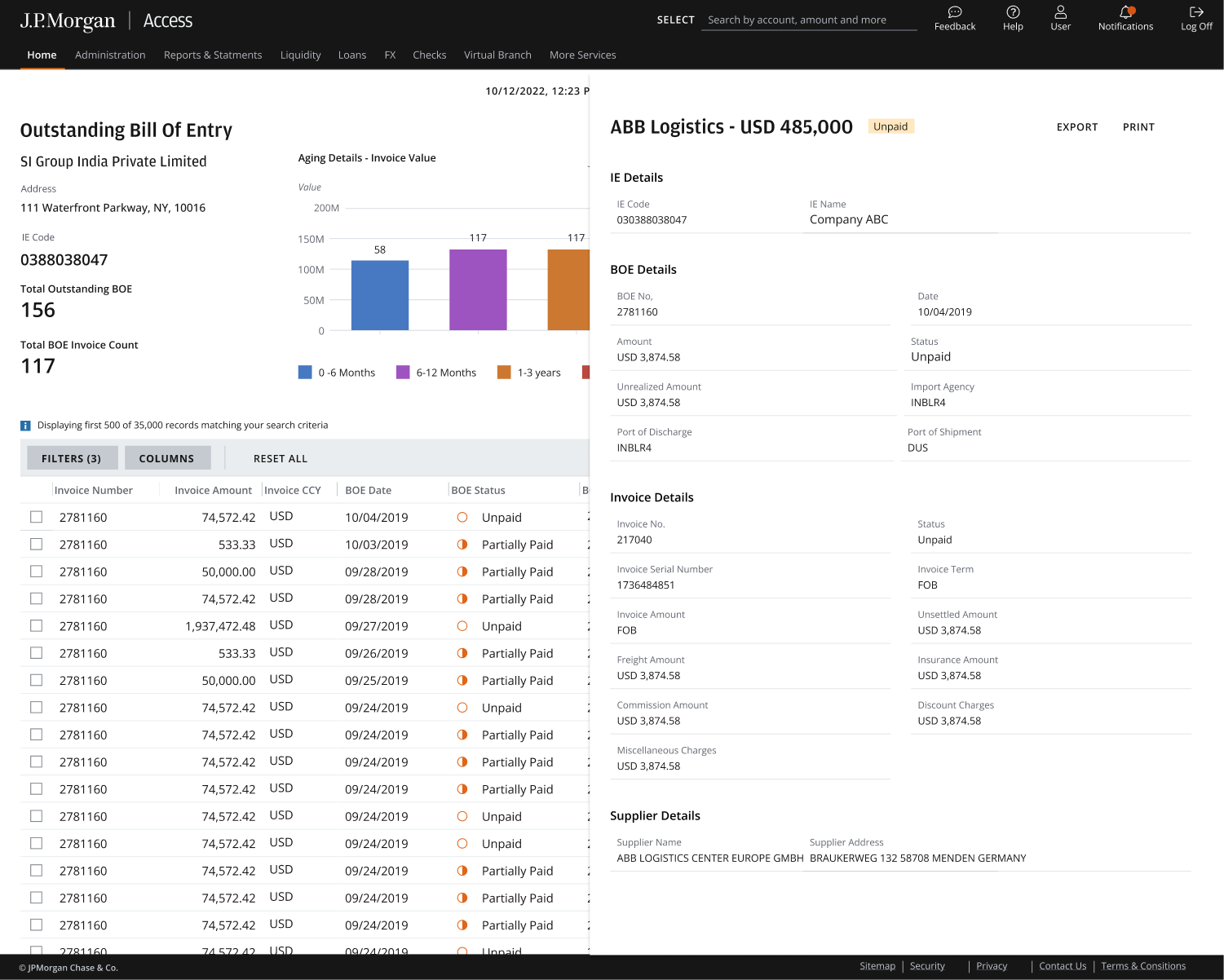
Before designing a single screen, I mapped all three reconciliation states against one page skeleton: summary metrics and two decision-focused charts up top, a configurable data grid below, and record detail in a side drawer.
Applying our design system
After creating the blueprint for the UI, I collaborated with our design systems team to utilize our latest approved & tested patterns. At the same time, we were able to successfully push our design system forward and be the first team to introduce expandable record drawers – an incredibly useful pattern for complex payments workflows.
Drawers replace pages
Record detail opens in a drawer, so the list never leaves the screen (two steps instead of five). The toolbar puts Filters, Columns, and Export within reach.
Crafting the grid
Working alongside Product, we mapped relevant fields to the grid, drawer, or export. The grid defaults to nine columns—invoice number, amount, currency, BOE date, BOE number, status, AD code, supplier, and actions. Invoice amount and BOE status stay in every row so treasury can prioritize payment without opening each record. IE code, unrealized amount, port codes, invoice charge lines, and supplier address sit in the drawer. Export carries the full field set for audit and internal reporting. Columns remain configurable.
Status markers sit in every row so importers can scan the grid without opening a record. Unpaid shows as an open circle; Partially Paid as a half-filled circle.
Determining the best chart
Clients needed to read penalty risk at a glance, not decode a chart. Labeled aging buckets surface the oldest, most exposed records first: a decision tool instead of decoration.